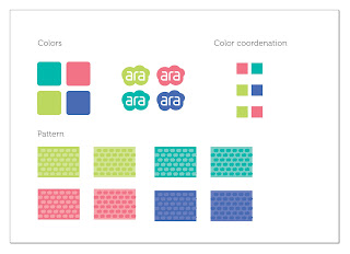
My personal identity. It is not final, but I will continue working on it after the class.
Saturday, July 30, 2011
Final Postcards
Unfortunetely I have just 2 from 10 that I believe had a good result.
So I am posting them as finals.
So I am posting them as finals.
Concept and swipes • Book covers
The concept for this collection came from an old idea I have of a book. The idea is to explore how historically art and science are always walking side by side. The first cover I used Trajan which is based on the Roman Square Capitals. The two words are like a mirror to each other. At that time art was used to register scientific discoveries, and science, in that case mathematics and perspective, was supporting art to make those registers look as close to reality as possible.
The second cover was based on the begining of print when art and science start to become closer and closer, and that is why I mixed the two words together simulating print blocks. The fonts are of course Carslon and Jenson.
The third is the most obvious. It is the digital era, when science and art are totally related and closely together. I used OcraB and Futura as examples of fonts from the XX and XXI century. The texture also is trying to simulate a binary code.
This was a very interesting assignment cause I did a research on type (although in the end I used the obvious periods since I had just 3 covers).
I am posting my swipes some of them has nothing to do with what I did in the end.
Final Book Covers
Here are the finals. I tried to keep the concept, although I know just designers will understand my font choices, but I believe that now they have a common identity that can hold them as a collection.
And here the first studies so that you can compare.
Final Posters
And my first composition for creating the posters that I did by hand, cuting and pasting paper and then draw in the computer.
I am posting the old ones so you can see the changes.
Friday, July 29, 2011
Branding
My swipes
The idea is to draw a logo for a papeterie specialized in kids products. So I liked the idea of the cloud which can lead to many interpretations as dreamy, imaginative, an idea or a Treetop, a sunny cloud.
Postcards NY Times
This was the hardest assignment for me. I still don't have anything that I believe it's worth finishing. But I'll post somethings I did and redid. I will not post the ones I showed in class because I really did them pretty fast and I do not consider a finished job.
Subscribe to:
Comments (Atom)


